Shadcn UI Product Card Blocks
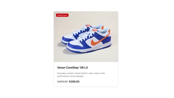
A product card displays individual product information in a contained, scannable format. It appears in product grids, category pages, and search results, serving as the primary product preview element that helps users quickly evaluate and select items.
Product card blocks combine product images, titles, prices, ratings, quick action buttons like add to cart or wishlist, stock indicators, and badge elements for sales or featured products. Effective implementations balance visual appeal with information density, using clear pricing, prominent images, and accessible action buttons.
Shadcn product card blocks follow a few common patterns: the image-first layout for visual browsing, the detailed layout with specifications, or the minimal layout for dense product grids. Browse our blocks to find the style that matches your product catalog and browsing experience.
