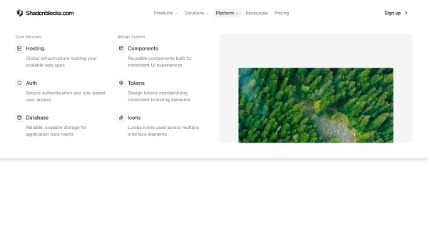
Shadcn UI Navbar Blocks
A navbar provides primary site navigation and branding at the top of pages. It appears across all pages of a website, serving as the persistent navigation element that helps users move between sections and access key actions.
Navbar blocks combine logo elements, navigation links, dropdown menus, search inputs, CTA buttons, mobile menu toggles, and user account indicators. Effective implementations balance navigation clarity with visual hierarchy, using clear labels, accessible interactions, and responsive behavior for mobile devices.
Shadcn navbar blocks tend to follow a few approaches: the centered layout with logo and links, the split layout with logo on left and actions on right, or the minimal layout with essential navigation only. Browse our blocks to find the structure that matches your site structure and navigation needs.
