Shadcn UI Bento Blocks
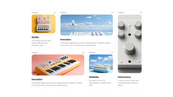
A bento section displays content in a grid layout with varied card sizes, creating visual interest through asymmetric arrangements. It appears on landing pages and portfolio sites, serving as a modern content showcase that combines multiple content types in an organized yet dynamic layout.
Bento blocks combine cards of different sizes, images, icons, headlines, descriptions, and interactive elements arranged in a grid pattern. Effective implementations balance visual variety with content hierarchy, using larger cards for featured content and smaller cards for supporting information.
Shadcn bento blocks follow a few common patterns: the asymmetric grid with varied card sizes, the symmetric grid with consistent spacing, or the featured layout with one large card and supporting smaller cards. Browse our blocks to find the arrangement that matches your content structure and visual goals.
