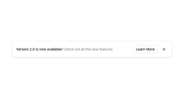
Shadcn UI Banner Blocks
A banner displays prominent messages, announcements, or calls-to-action in a horizontal format. It appears at the top of pages, in headers, or as standalone sections, serving as a high-visibility element that captures attention and communicates important information.
Banner blocks combine headline text, supporting copy, call-to-action buttons, close buttons for dismissible banners, and visual elements like icons or background colors. Effective implementations prioritize visibility, use clear messaging, and provide prominent CTAs that drive desired actions.
Shadcn banner blocks follow a few common patterns: the top banner layout, the inline banner within content, or the sticky banner that remains visible while scrolling. Browse our blocks to find the style that matches your messaging goals and page context.
