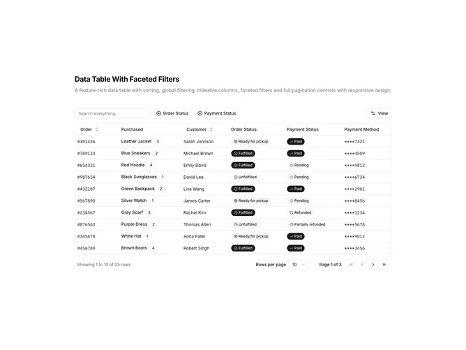
Data Table 12 block design & features
DataTable12 is a left-aligned section with a heading, description, a toolbar with global search and faceted filter buttons, a View dropdown, and a full-width data table with pagination controls below. The toolbar contains a text input for global search plus two filter buttons that open popover menus for filtering by order status and payment status. Each filter button shows a dashed border, a plus icon, and displays selected filter values as badges. The table displays order data with columns for order ID, purchased item with quantity badge, customer name, order status badge, payment status badge, and payment method.
Light background with dark text. The table has a thin rounded border. Faceted filter buttons use dashed borders and show selection counts. Filter popovers contain searchable checkbox lists with item counts and a clear option. Status columns display badges with icons indicating fulfilled, ready for pickup, unfulfilled, paid, pending, refunded, or partially refunded states. Different badge variants distinguish status types. The View dropdown allows hiding columns. The pagination area includes row count, page size dropdown, page indicator, and navigation buttons. Static layout with no entrance animations.
This is a data table with faceted filtering for categorical columns. The faceted filter pattern is useful when columns have a known set of possible values and users want to select multiple values at once. The filter popovers show counts for each option, helping users understand data distribution before filtering.